
|
The following pieces are what I consider improvements of themselves. If I wasn't satisfied with the "first draft" of the piece, I would create a new version that was closer to what I had envisioned. 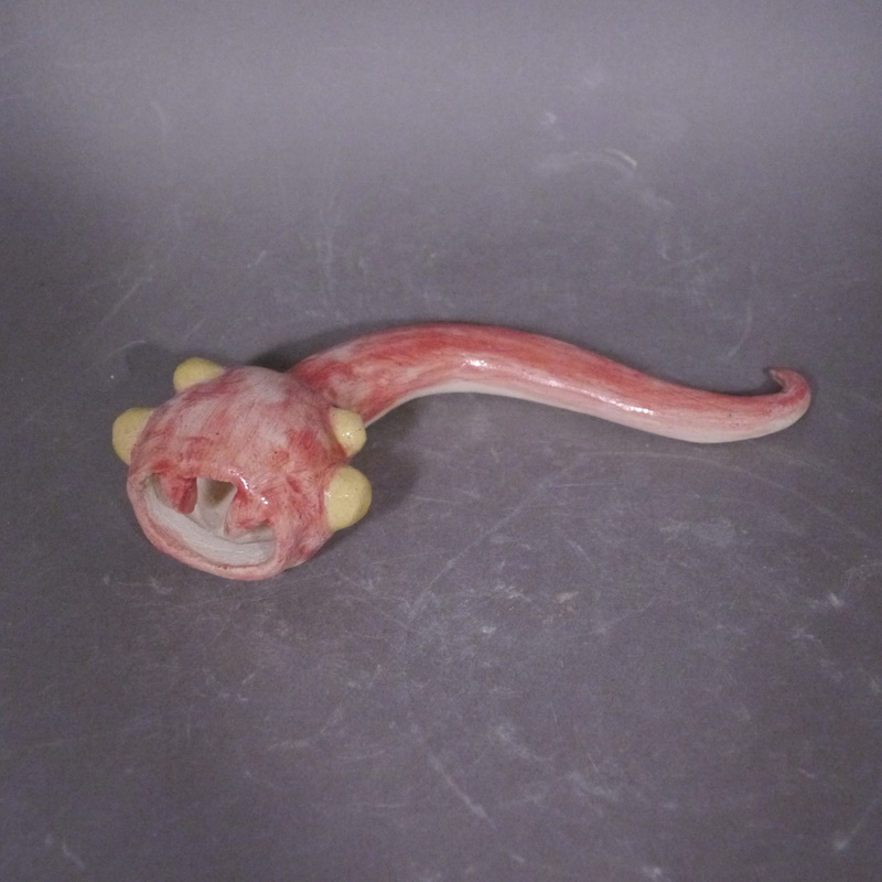 This sculpture was originally titled "Death Worm Spawn", but it turned out considerably more serpentine than worm-like. 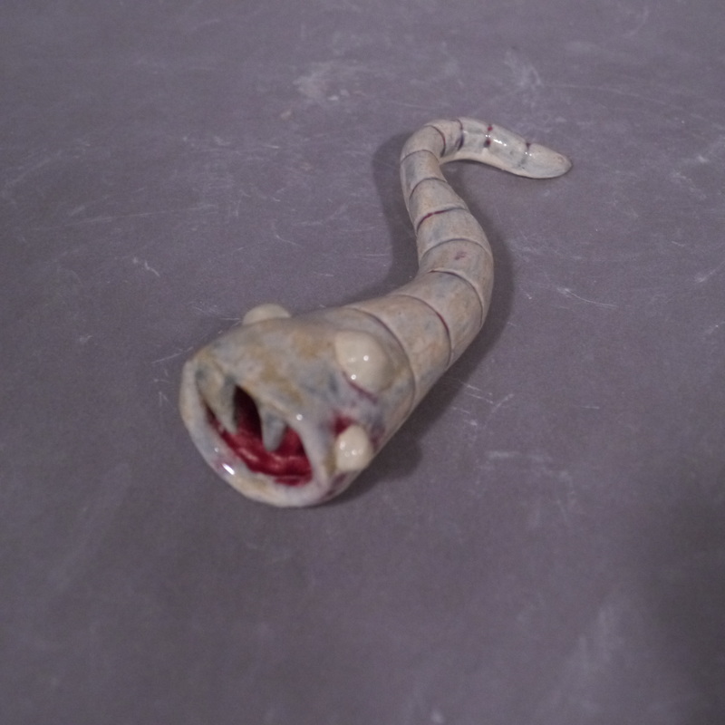 The second version is significantly closer to the concept sketch, but the glaze turned it a sickly purple when it was meant to be red. However, I think this new color scheme conveys the idea of the piece better. 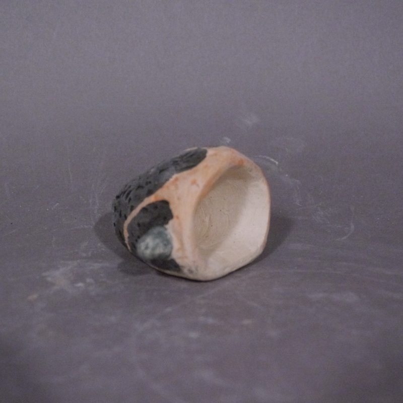 This piece was my first attempt at using paper in clay, along with underglaze. Unfortunately, it looks rather dull for a piece that's meant to resemble a volcano. 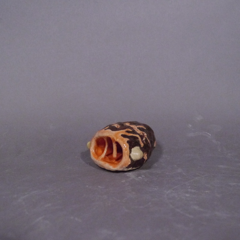 The "redux'' as I like to call it, uses a more detailed design and a warmer color scheme. Additionally, the holes from the paper in the clay are more visible.
0 Comments
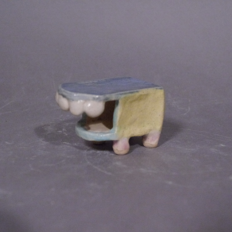 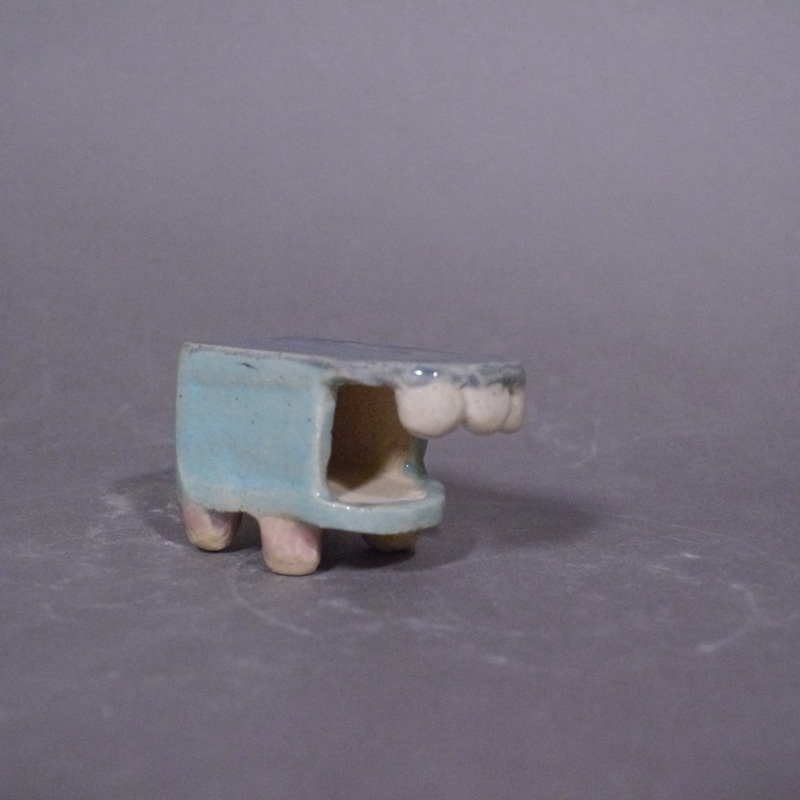 It's about time I updated this blog! Please enjoy pictures of the finished version of the piece featured in the last post. It's currently untitled, but (as said in the last post) it took inspiration from adult collector toys. 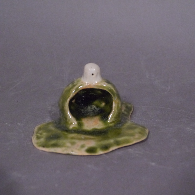 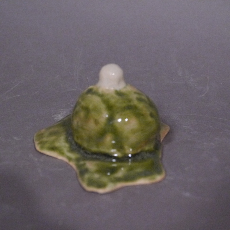 This piece is also untitled, and it was loosely based off "The Blob'', as well as some enemies from the Zelda series. 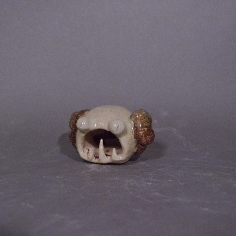 "Harpy'' as its name would imply, took inspiration from the harpies of Greek mythology. However, the harpies of mythology were enormous birds with the heads of ugly women, while this piece hardly fits this description at all. In fact, the only indications that it is based on a harpy are its somewhat-flesh-colored body and brown feathered wings.
|
AuthorArchives
March 2018
Categories |
 RSS Feed
